Drupal Field Types Tutorial
Field types in Drupal
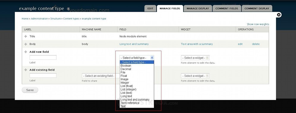
Drupal comes with about a dozen preconfigured field types by default. Fields can be added to content types, comments, users, and taxonomy. The types of fields that you can select when adding a new field are the same for all the above mentioned areas. The type is selected while creating the field:
Once the field is created the field type cannot be changed. For more information on how to manage fields read the tutorial on managing fields in Drupal.
Each field type can be used with different widgets, and each field has various settings that can be configured. The specific settings depend on the field type. Here we'll describe briefly the field types that come prepackaged with Drupal:
Boolean-the boolean field type is for including checkboxes/buttons on the create/edit form. With this field type you can choose two widgets. One is for buttons with values such as 0 and 1, yes and no, etc. (whatever you specify in the field's options) that you can mark; and the other widget is for a single on/off checkbox. Note that the checkboxes/buttons appear only in the admin panel. In the case with content types, for example, only the value of the marked checkbox appears on the frontend, not the checkboxes themselves. Of course, if from the Manage Display page you select the field and its value to be hidden, it won't be displayed on the frontend.
Decimal-this field type is intended for inputting numbers. It's useful, for example, if you want to include a field in a content type for a price(s), telephone numbers, etc. The only widget that you can choose for this field type is text field. From the settings of that field type you can specify the maximum allowed number of digits, the decimal marker, etc.
File-as the name implies, this field type is used for attaching a file. An option will be included on the create/edit form in the admin panel for uploading files. When it comes to content types the uploaded files can be opened/downloaded by visitors on the frontend of the site when viewing nodes with attached files. The only widget available for that field type is again called file. From the settings for that field type, you can specify the allowed file extensions (e.g. txt, doc, jpg, etc.), the maximum allowed file size, etc.
Float-this field type is for inputting numbers. As with the decimal field type you can also only select the widget text field. However, this field type has fewer options than the decimal one.
Integer-this is another field type for inputting numbers. However, unlike decimal and float, integer is only for natural numbers without decimals. For example, 123 is an integer, while 123.4 is not. The widget that is used with this field type is text field. This field type can display a maximum of ten digits by default.
Image-you can use this field type for uploading and displaying images. For example, if a content type has this field added, when you create/edit a node from that content type you can upload an image. The image will be displayed on the frontend to all visitors. If you want the image just to be listed as a file which can be downloaded, you can use the file field type. The image field is used, for example, by the article content type that comes preconfigured with Drupal. The settings that you can configure for this field type include the maximum and minimum allowed dimensions of the image, the maximum allowed size (e.g. 1 megabyte), the allowed file extensions, etc.
List (float), List (integer), List (text)-With these field types you can create lists for inputting data. All the list types can be used with a widget that provides a drop-down menu for selecting values (select list), or a widget that uses checkboxes. When you add the field, in its settings you can create the list that will be available on the create/edit page on the backend. Each item in the list has a key and a label. The key is stored in the database and the labels are displayed in the admin panel, and also on the frontend. The list (float) and list (integer) types use numbers for keys, while the list (text) type uses words/letters. To create the list just follow the instructions provided in the admin panel on the page with the field settings. Keep in mind that the whole list will be shown only in the admin panel. When it comes to content types, for example, only the list item that you have selected while creating/editing a node from that content type will be shown on the frontend.
Long text-you can use this field type to input a body of text. The widget available with this field type is text area (multiple rows). When you add this field, there'll be a text area on the create/edit page in the admin panel for inputting text.
Long text and summary-this field type is also for inputting a body of text, but it also allows you to include a summary. An example of how this functions is the article content type that comes preconfigured with Drupal. It has this field type in its configuration. In fact, this field type is automatically included in each new content type that you create; it's labeled body. The widget that is used with this field type is Text area with a summary. From the settings of the field type you can choose whether authors should be able to specify a summary explicitly (enabled by default) instead of the automatically trimmed text used as a summary.
Text-this is also a field type for inputting text, but it's intended for shorter texts. When you create field from that field type, you can set the maximum length of the text in terms of the number of characters (255 by default).
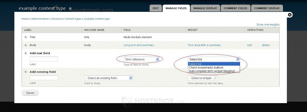
Term reference-this field is used for inputting taxonomy terms. Taxonomy terms are used for categorizing and linking the content on your site. With this field type you can choose three widgets: select list, checkboxes/radio buttons, and autocomplete term widget (tagging).
As an example, you can refer to the article content type which has this field with the autocomplete term widget (tagging) by default. So in this case when you create/edit articles you can type some tags related to the particular article. These tags are displayed on the frontend (both in the teaser and full view), and when a visitor clicks on a tag all articles and nodes from other content types containing this tag as reference will be displayed.
The other two widgets produce the same results. The difference is that with the tagging widget on the create/edit form (e.g. for articles) you're provided with a text field in which you can type a list of words. These words are automatically added as taxonomy terms to the vocabulary group that you have chosen when adding the field.
Right after you add a field from this type, you'll be shown the field settings where you have to choose a vocabulary group to be used. The same is true if you select the checkboxes/radio buttons or the select list widget. The difference is that in the first case on the create/edit page you'll be provided with buttons for each taxonomy term that exists in the selected vocabulary, and in the second case you'll be able to choose a term with a drop-down menu. With these two widgets you can select only existing terms, while, as we said, with the tagging widget the terms that you list will be added automatically if they don't exist.